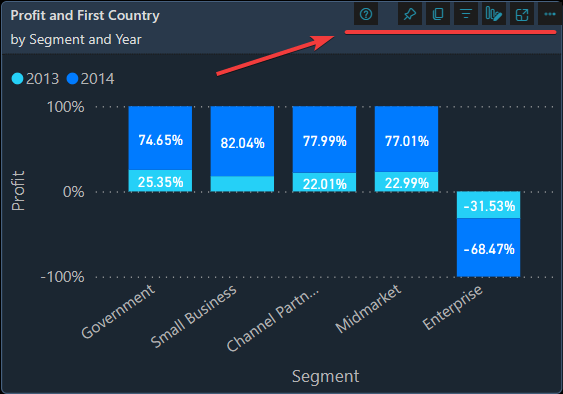
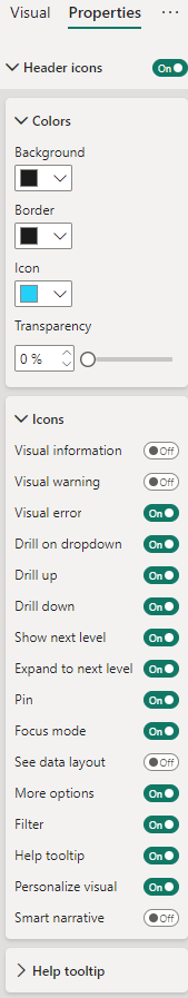
Visual Header
The '"visualHeader"' property can be defined for all visuals. It includes settings for
- visibility
- background color
- foreground color
- border color
- transparency
- to show or hide various buttons
Syntax
{
    "name": "LeanProductivity",
    "visualStyles": {
        "*": {
            "*": {
                "visualHeader": [{
                    "show": true,
                    "background": { "solid": { "color": "#1C1C1C" } },
                    "foreground": {  "solid": { "color": "#25D0F7" } },
                    "border": { "solid": { "color": "#1C1C1C" } },
                    "transparency": 0,
                    "showVisualInformationButton": false,
                    "showVisualWarningButton": false,
                    "showVisualErrorButton": true,
                    "showDrillRoleSelector": true,
                    "showDrillUpButton": true,
                    "showDrillToggleButton": true,
                    "showDrillDownLevelButton": true,
                    "showDrillDownExpandButton": true,
                    "showPinButton": true,
                    "showFocusModeButton": true,
                    "showFilterRestatementButton": true,
                    "showSeeDataLayoutToggleButton": false,
                    "showOptionsMenu": true,
                    "showTooltipButton": false,
                    "showCommentButton": false,
                    "showPersonalizeVisualButton": true,
                    "showSmartNarrativeButton": false
                }]
            }
        }
    }
}
Effect
Settings
Back to Visual Styles