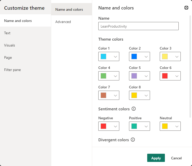
Bad, Neutral, Good
The properties labeled as "bad", "neutral", and "good" are typically used to define the color palette for different data points or states within visuals. These properties allow you to assign specific colors to represent varying degrees or statuses of data, making it easier for users to interpret information at a glance.
For instance, you might use the "bad" color to indicate negative trends or critical data points, the "neutral" color for average or neutral data, and the "good" color for positive or favorable data.
By utilizing these properties, you can create visual cues that enhance the understanding of your data and provide valuable insights within your Power BI reports and dashboards.
Syntax
{
	"name": "LeanProductivity",
    "bad": "#FC3634",
    "neutral": "#FFD700",
    "good": "#18BC9C"
}
Settings