Icons
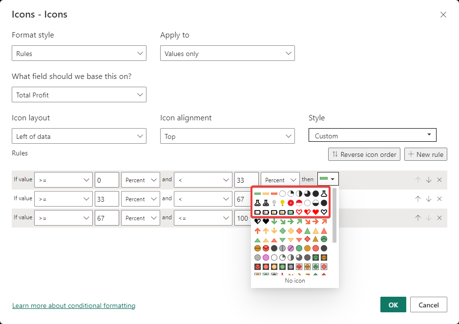
Power BI comes with a set of pre-defined icons that can be used in various visuals. It also allows you to use your own icons. In this section, you can define those icons.
Syntax
{
    "name": "LeanProductivity",
    "icons": [
        {
            "description": "Green Dash",
            "url": "data:image/svg+xml;utf8, <svg xmlns='http://www.w3.org/2000/svg' viewBox='0 0 15 15'> <rect x='0.5' y='5.5' fill='%2384C28A' width='14' height='4'/> <path fill='%23449E44' d='M0,5v5h15V5H0z M14,9.001H1V6h13V9.001z'/> </svg>"
        },
        {
            "description": "Yellow Dash",
            "url": "data:image/svg+xml;utf8, <svg xmlns='http://www.w3.org/2000/svg' viewBox='0 0 15 15'> <rect x='0.5' y='5.5' fill='%23F9D087' width='14' height='4'/> <path fill='%23F9B23E' d='M0,5v5h15V5H0z M14,9.001H1V6h13V9.001z'/> </svg>"
        },
        {
            "description": "Red Dash",
            "url": "data:image/svg+xml;utf8, <svg xmlns='http://www.w3.org/2000/svg' viewBox='0 0 15 15'> <rect x='0.5' y='5.5' fill='%23F78272' width='14' height='4'/> <path fill='%23F25021' d='M0,5v5h15V5H0z M14,9.001H1V6h13V9.001z'/> </svg>"
        }
    ],
}
Effect
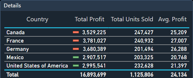
Icons defined in this way, will be available for conditional formatting.


Related
- Bad, Neutral, Good
- Data Colors
- Filter Card
- Foreground, Background
- Minimum, Center, Maximum
- Outspace Pane
- Outspace Pane - Filter Pane
- Page
- Structural Colors
- Table Accent
- Text Classes
- Theme colors
- Theme Name
Icon definitions from: Icons upon Icons - (powerbi.tips)