CSS - Columns Layout
Source
User "Kapirklaa" on the Obsidian Discord Server for the two-columns layout. I added the code for three columns myself.
Setup
Go to Settings, Appearance, and scroll all the way down to the CSS snippets section. You might already have some there, or not. It does not matter for us.
Click on the folder icon. This should open the local folder containing the snippets. Create a new file and give it a name that makes sense to you. For example, columns.css. Make sure that the file extension is css. If you don't see your file extensions, click on View, Show, and File name extensions (in Windows Explorer).
Now open the file and copy the CSS code below into it. Save the file, go back to Obsidian and refresh the list of snippets. Enable this one, and that should do it. If it does not, you may have to restart Obsidian.
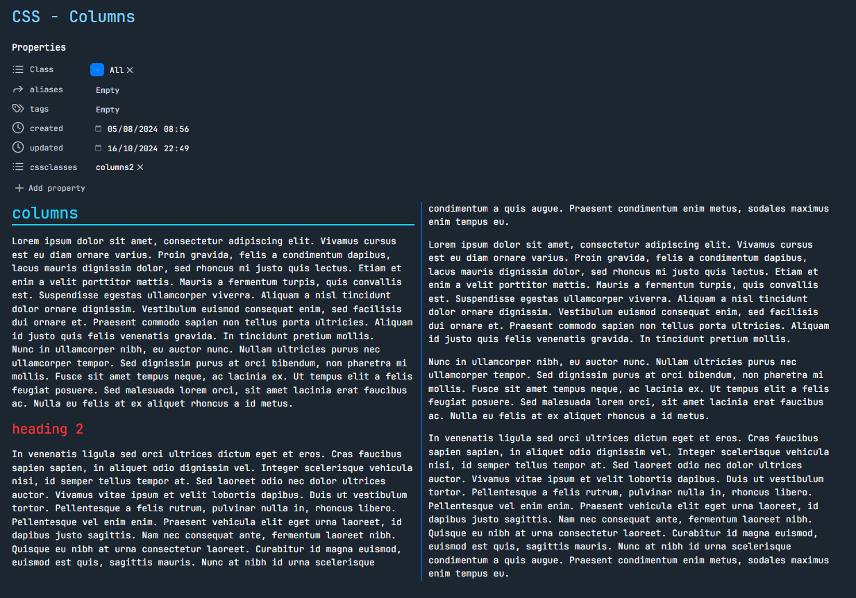
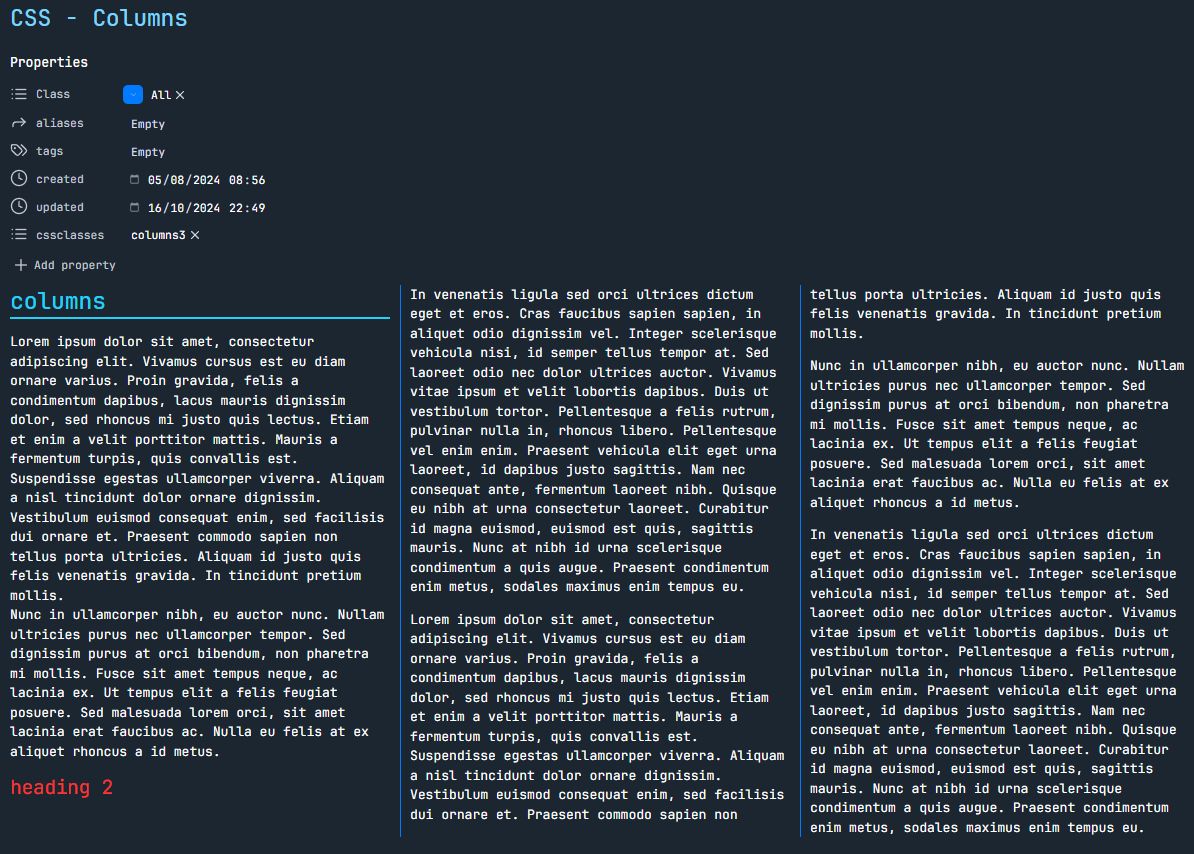
To apply the respective style to a note, the note's frontmatter must include cssclasses: columns2 or cssclasses: columns3.
Result
Two Columns

Three Columns

Code
/* Two-column layout for Obsidian notes with "columns2" cssclass */
.markdown-preview-view.columns2 .markdown-preview-section {
    column-count: 2;
    column-gap: 20px;
    column-rule: 1px solid #007BFF;
    width: 100%;
    box-sizing: border-box;
    padding: 10px;

	/* Exclude the header (inline-title and metadata-container) from the column layout */
	.mod-header {
		column-span: all;
	}

	/* Ensure proper handling of headings */
	h1, h2, h3, h4, h5, h6 {
		break-inside: avoid-column;
	}

	/* Ensure proper handling of images */
	img {
		max-width: 100%;
		break-inside: avoid-column;
	}

	/* Prevent table breaking */
	table {
		width: 100%;
		display: table;
		break-inside: avoid-column;
	}

	/* Ensure proper handling of lists */
	ul,  ol {
		break-inside: avoid-column;
	}

	/* Ensure code blocks do not break across columns */
	pre {
		break-inside: avoid-column;
		width: 100%;
		overflow-x: auto;
	}
}

/* Three-column layout for Obsidian notes with "columns3" cssclass */
.markdown-preview-view.columns3 .markdown-preview-section {
    column-count: 3;
    column-gap: 20px;
    column-rule: 1px solid #007BFF;
    width: 100%;
    box-sizing: border-box;
    padding: 10px;

	/* Exclude the header (inline-title and metadata-container) from the column layout */
	.mod-header {
		column-span: all;
	}

	/* Ensure proper handling of headings */
	h1, h2, h3, h4, h5, h6 {
		break-inside: avoid-column;
	}

	/* Ensure proper handling of images */
	img {
		max-width: 100%;
		break-inside: avoid-column;
	}

	/* Prevent table breaking */
	table {
		width: 100%;
		display: table;
		break-inside: avoid-column;
	}

	/* Ensure proper handling of lists */
	ul,  ol {
		break-inside: avoid-column;
	}

	/* Ensure code blocks do not break across columns */
	pre {
		break-inside: avoid-column;
		width: 100%;
		overflow-x: auto;
	}
}